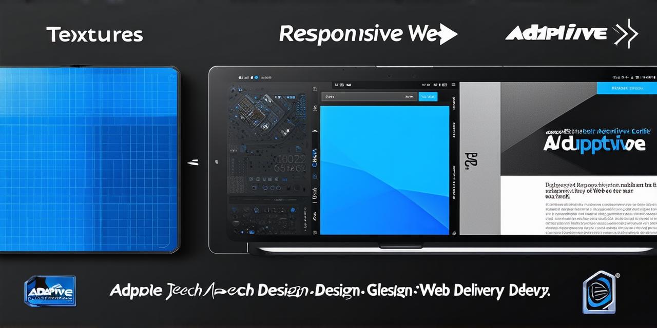
Responsive Web Design: The Basics
Responsive web design refers to an approach that uses a fluid grid layout and flexible content to create websites that adapt automatically to the screen size of the device they are being viewed on. This means that the same website will look and function differently on a desktop, tablet, and smartphone.
One of the main benefits of responsive design is that it allows you to create a single, consistent user experience across all devices, without having to maintain multiple versions of your website for each one. This can save time and resources, and make it easier for users to find what they’re looking for on your site.
Adaptive Web Delivery: The Basics
Adaptive web delivery refers to an approach that uses a series of fixed layouts and predefined rules to create websites that are optimized for specific screen sizes or devices. This means that you would have to create multiple versions of your website, each with its own layout and content, based on the device or screen size it will be viewed on.
The main benefit of adaptive web delivery is that it allows you to create highly optimized websites that are specifically tailored to the needs of a particular device or screen size. This can lead to faster load times and improved user experience, but it requires more planning and development time than responsive design.
Which Approach is Better?
The choice between responsive web design and adaptive web delivery will depend on your specific needs and goals as a web designer. Here are some factors to consider:
- Budget and Resources: Responsive web design typically requires less development time and resources than adaptive web delivery, since you only need to create one version of the site that adapts automatically to different devices. However, if you have a larger budget and more resources, you may be able to invest in multiple versions of your site with highly optimized layouts for specific devices.
- User Experience: Responsive web design is generally considered to be more user-friendly than adaptive web delivery, since it allows users to access the same website on any device without having to navigate through multiple different versions. This can lead to a smoother and more seamless user experience.
- Device Specific Needs: If you have specific needs for a particular device or screen size (e.g. if your site is heavily focused on e-commerce, and you need highly optimized product pages for mobile users), adaptive web delivery may be the better choice. This approach allows you to create highly optimized layouts specifically tailored to the needs of that device or screen size.
- Flexibility: Responsive web design is generally more flexible than adaptive web delivery, since it can adapt automatically to different devices and screen sizes. This means that you can make changes to your site’s layout or content without having to update multiple versions of your site.

Case Studies and Personal Experiences
To illustrate the differences between responsive web design and adaptive web delivery, let’s look at two real-life examples:
- Apple’s Website: Apple’s website is a great example of responsive web design in action.